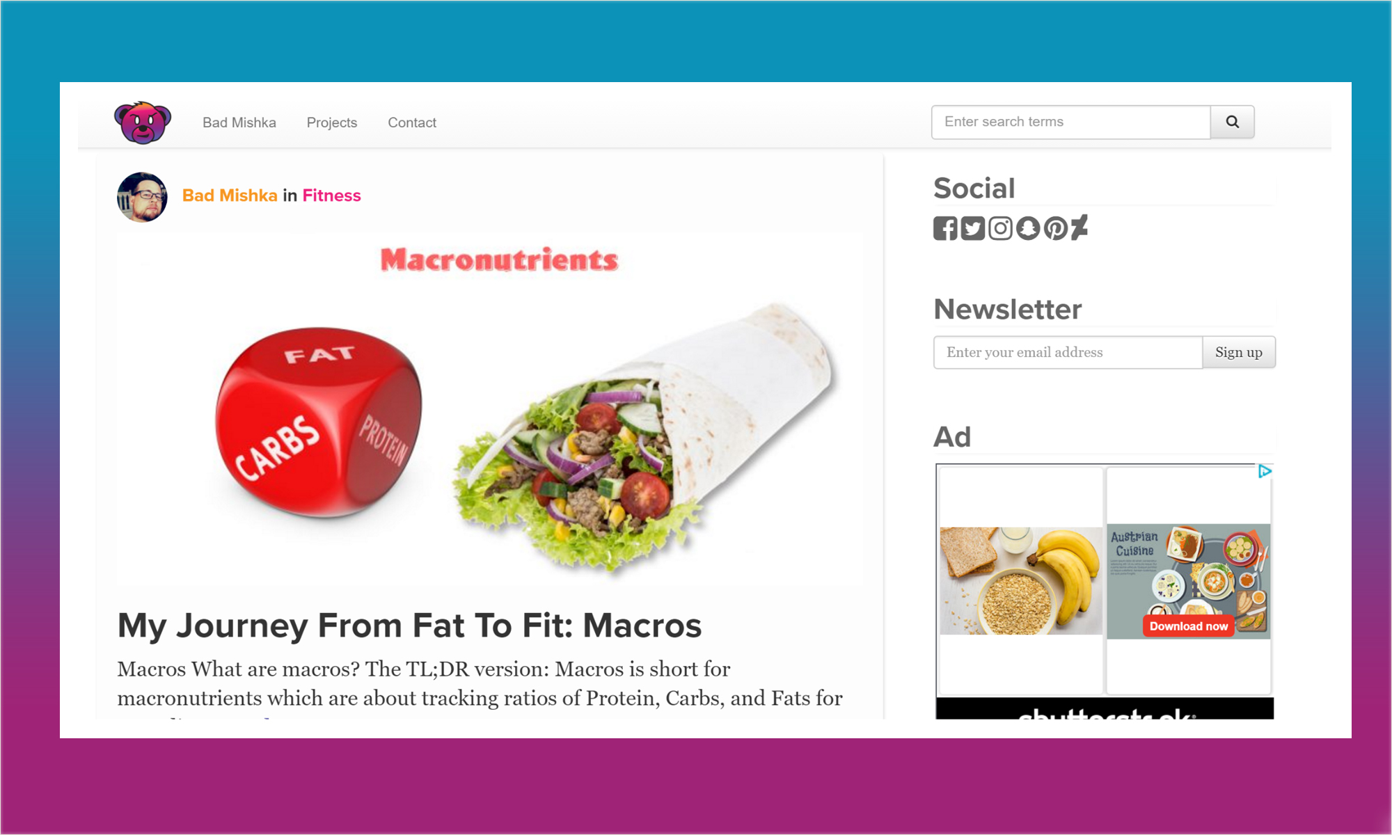
There is a new theme in town.
The Why
The old theme just was not cutting it. It just had too many limitations. I purchased the old theme “ReadMagazine” from Envato’s ThemeForest.
Generally, it is more economical to purchase a theme than it is to create one from scratch. It is cheaper to pay $50 for a theme and tweak it than it is to spend forty plus hours creating a new theme from scratch, unless tweaking the theme requires reworking or rewriting the theme that was purchased.
I needed a theme that fulfilled the following:
- Easy to edit
- Includes or allows users to expand to all the social icons I wanted, which includes Gitlab and Snapchat.
- Friendly for social media actions Twitter cards, Facebook posts, and Pinterest.
- Allows for multiple post format types: e.g. posts without pictures, chat logs, video, etc.
- Friendly to Adds.
- Focused on content.
I could not find a theme that adhered to that. Many themes use massive frameworks and their own way of styling things that make the themes harder to edit. Zero of the themes allowed for a Snapchat or Gitlab icon and profile link.
Frustrated, I decided to build my own theme. After researching the options out there, I decided to use a combination of Bootstrap 3, Font Awesome, Less, Gulp, Node, and Timber to build the theme.
Timber is a life saver. One of the most frustrating aspects of building a WordPress theme is the lack of master layout for theming. WordPress still lives in a dated world where PHP is the spaghetti templating language. Timber is built on top of Twig, a template engine with a mustache-like syntax.
Timber really focuses on design. It keeps the programming logic simplistic and easy to follow. Best of all, it enables the use of master layouts pages.
    {% block content %}
    <article class="tease">
        <div class="meta">
        <img class="img-circle" style="max-width: 50px" src="{{post.get_author.avatar}}"  />
        <a class="author-link" href="{{post.get_author.link}}">{{post.get_author.name}}</a> in <a class="category-link" href="{{ post.terms('category')[0].link }}"> {{ post.terms('category')[0] }} </a>
        </div>
        {% if post.get_thumbnail %}
            <div class="viewport">
                <img src="{{post.thumbnail.src|resize(760)}}" />
            </div>
        {% endif %}
        <h2>
            <a href="{{post.link}}">{{post.title}}</a>
        </h2>
        <p>
            {{post.get_preview(25)}}
        </p>
    </article>
    {% endblock %}
I decided to use Less1 because Font Awesome and Bootstrap 3 are both written in Less. Bootstrap 4 only has SASS templates.
Using all of these tools, I put together a theme that fulfilled all my primary needs along with adding a few extras. I also added the functionality for infinite scrolling and the ability to create a slide slow from any article. This is especially useful for following step-by-step tutorials.
I’m not going to put ads in those slideshows. The whole point to make the step-by-step instructions easier to follow and digest.
The featured images are also key. In the old theme, Facebook had a hard time pulling the image from the page. In the redesign, I spent some time on first pass at responsive feature images that make it easy for Facebook to grab the primary image for a post. I still need to add alternate thumbnails for sources.
All in all, this was a good solid first step in making the site more marketable as the content is now easier to digest and create. The theme went live on 9/20/2016. I will continue to improve the theme over time.
The source code can be found on Gitlab
- Disclaimer: Less came to market with the CSS style template syntax before SASS had the .scss syntax. Less had a .NET port before libsass existed. Less doesn’t come with a zealot fanbase. As a reward, I tend to favor LESS over SASS. Granted, should CSS ever support mixins, I would drop preprocessors altogether. ↩
